

 Subtle, Soothing, and Airy
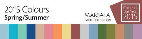
The fashion industry is bringing in the new year by encouraging us to unplug from technology more often, and reconnect with our natural environment by wrapping ourselves up in soft, organic hues.
The colours for the first half of 2015 are the toned down and calmer versions of their brighter selves. For example Strawberry Ice (sixth colour from the left above) is the lighter and cooler side of vibrant Strawberry Red. Classic Blue, Toasted Almond, Glacier Gray, and Titanium are the anchors – the basics. Punch up these background neutrals with bold or soft colours to add warmth, energy, and personality.
Colours of Choice
I’ve selected six favourite hues and my favourite neutral for this upcoming season. What are your top picks?
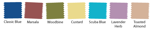
Colours from left to right: Classic Blue, Marsala, Woodbine, Custard, Scuba Blue, Lavender Herb, and neutral Toasted Almond.
Read what the colour experts are saying: Pantone Spring Colours 2015
